What's your story... Abcam
Brand, marketing and website design

In 1998 Jonathan Milner, came up with the idea for a web-based antibody company. The big idea was that Abcam would sell the best antibodies in the world with the most comprehensive, honest and up-to-date datasheets, fast delivery and helpful customer service and technical support.
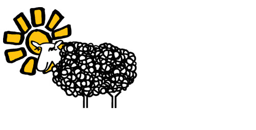
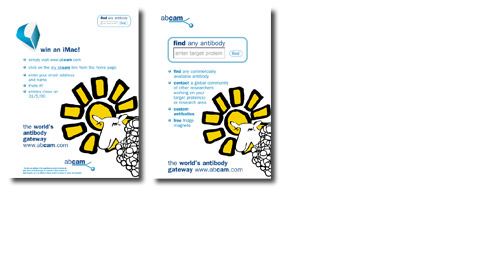
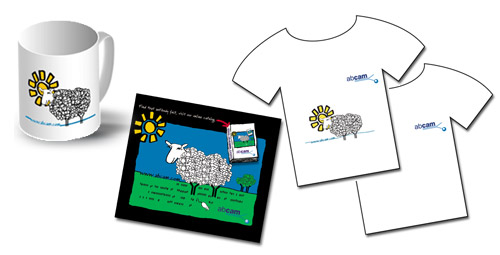
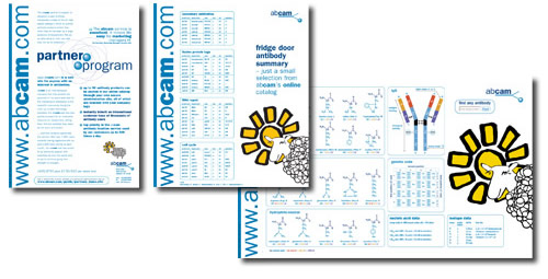
The identity needed to say we’re big and corporate and serious and yet had to also appeal to the key audience of young researchers. Angie developed a meaningful logo – it’s an antibody sticking to a protein, and used a light blue and aqua colour palette that suggested ‘Cambridge’, drawing upon all the weighty connotations of being a biotech start up in this university city of repute. Molly the sheep was a fun element that again was designed to appeal to the young researchers – why – well antibodies for research are often grown in chickens, but these were grown in sheep that grazed in a field on the outskirts of Cambridge. If you look at Molly, she has a protein structure coat – scientists get it!
Marketing the company was with well placed ads, both online and offline in prestigious publications such as Nature, and lots of freebies. The logo and website have moved on a little in it's lifetime, but then, abcam is now an international multi-million pound company. » launch website